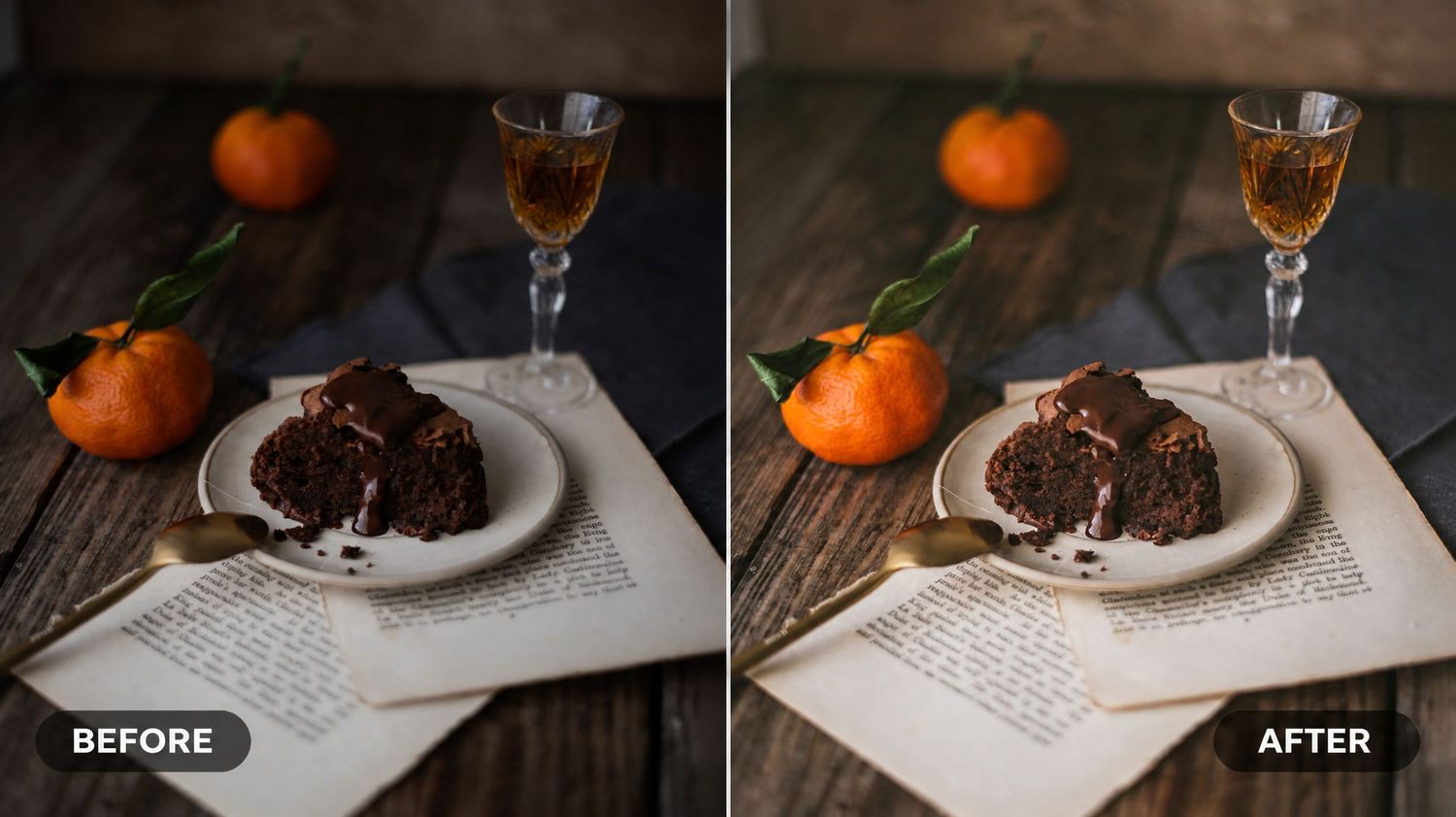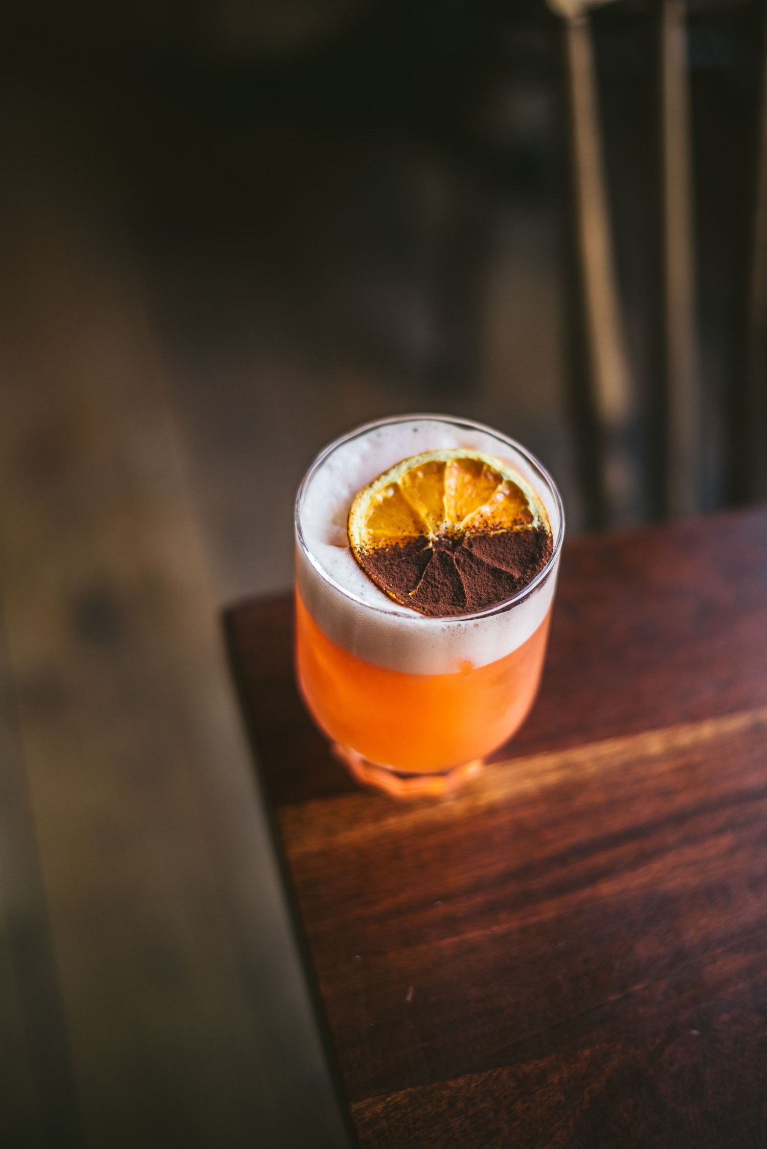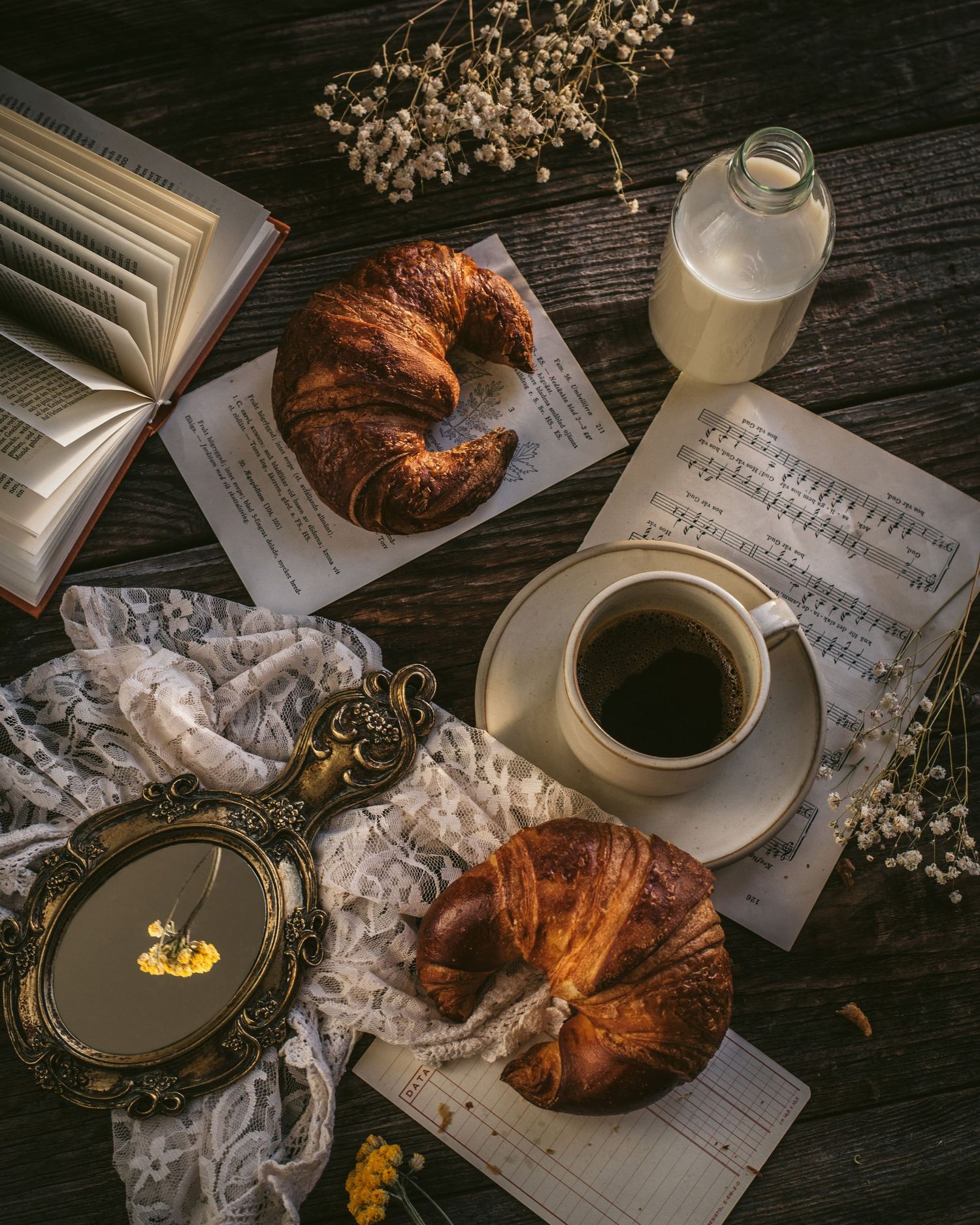
There is a drawer in my studio I have not opened in three years.
It is full of backdrops I thought I needed when I started.
A faux marble printed on vinyl. A piece of corrugated metal. A roll of black paper. Three different sheets of slate-effect contact film. A sheet of patterned wallpaper I bought because I saw it in someone else's photograph and thought it would work in mine.
None of them ever did.
Every single food photograph that ever felt right to me — the kind that made me put the camera down and just look — was taken on one of two surfaces. Linen, or wood. Not a different kind of linen every week. Not a different wood every season.
The same length of unbleached cotton draped across the same length of worn pine I rescued from a kitchen renovation eight years ago. After a while I stopped trying to break the pattern. I started trying to understand it.
Here is what I have come to know.
Why linen
Linen is the only surface I can put behind food that does not argue with it.
It catches light gracefully. It holds shadow without going flat. It introduces texture without introducing pattern. And — most of all — it signals to the viewer's eye that this is somebody's actual table. Not a set. Not a styled scene. A table where someone has cooked, and eaten, and folded the cloth back into a drawer.
The linens I shoot on are almost always unbleached cotton or natural-fibre linen in soft, muted tones: oat, raw flax, faded indigo. Nothing white. Nothing bleached. Nothing crisp. The ones I love most are the ones with small visible imperfections — a slubbed thread, a soft crease that will not iron out, the small permanent shadow of a stain that washed almost away but not quite.
I reach for linen when the food wants intimacy. Pastry. Scattered ingredients. A single slice of cake on a saucer. A bowl of soup beside a torn piece of bread. Anything that wants the viewer to feel like they have just walked into the kitchen and could, if they wished, sit down and eat.
Linen is the only surface that makes a photograph feel like it is set on someone's actual table.
The painters knew this. Look at any Dutch still life from the seventeenth century and you will find a piece of linen draped across the table beneath the bread, the cheese, the wine glass. Four hundred years before there was a camera, the still-life makers had already decided.
Why wood
If linen is the surface that signals intimacy, wood is the surface that signals weight.
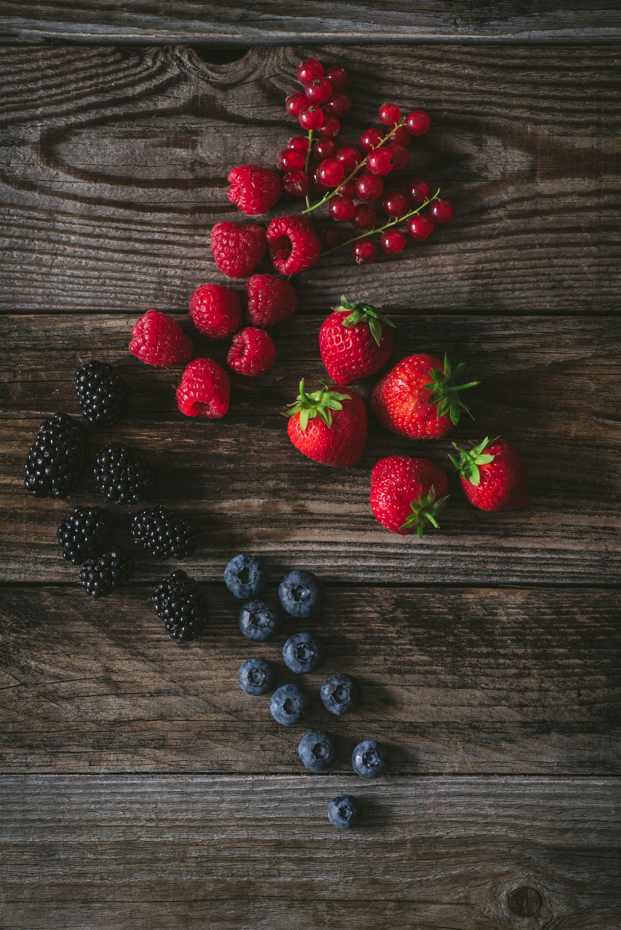
The kinds of wood I shoot on are worn ones. An old kitchen table top. A piece of barn wood from a friend's grandfather's farm. A chopping board so soft and silvered from years of use that the knife marks have become part of the grain. Nothing varnished. Nothing new. The newer the wood, the more it photographs like a set; the older the wood, the more it photographs like a story.
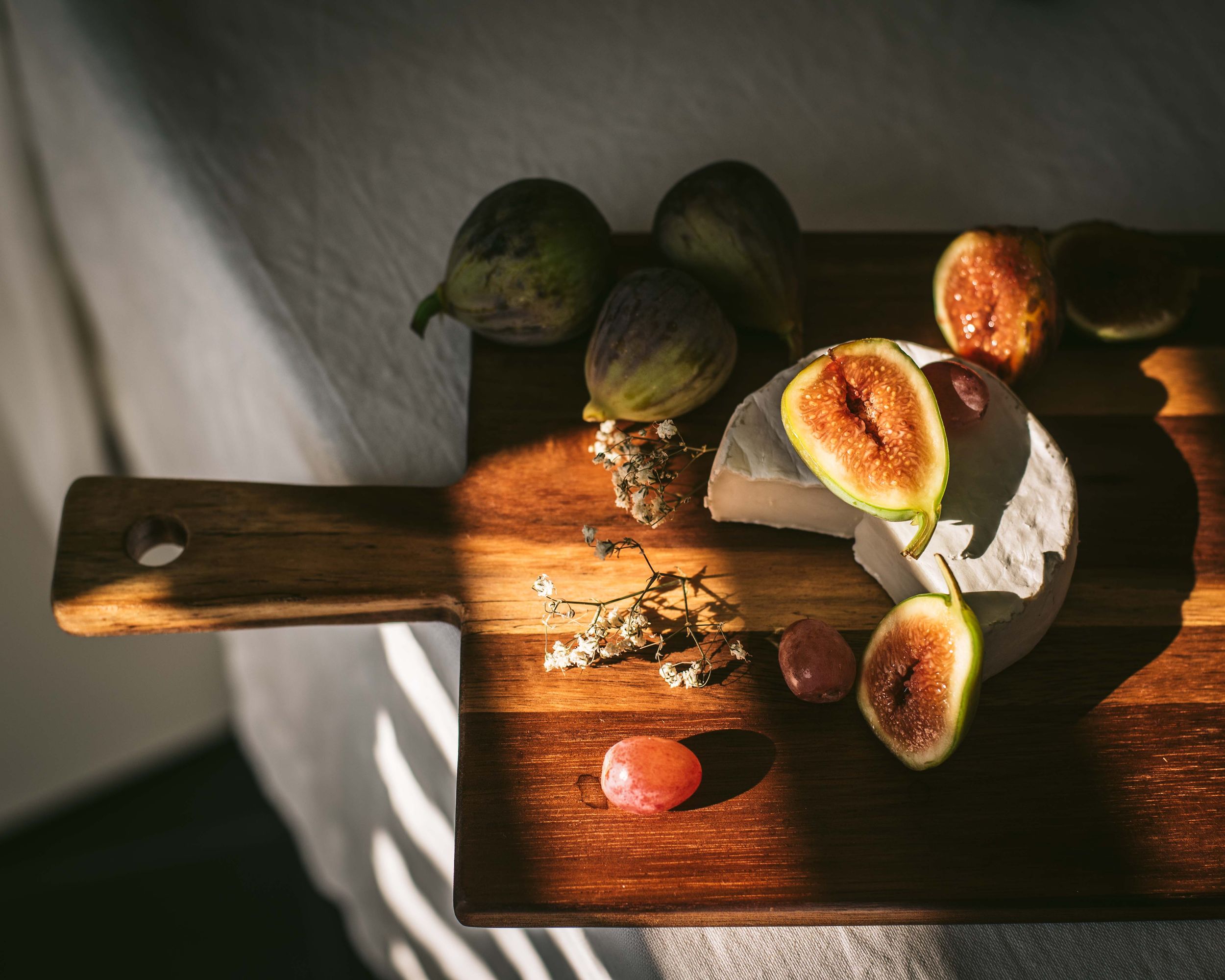
Wood gives chiaroscuro photography something almost nothing else can: it holds the shadow. When you place a piece of fruit on dark, worn pine and let a single window light fall across it from the side, the shadow does not just sit beneath the fruit — it sinks into the wood, becoming part of the surface. The photograph reads as one inhabited scene instead of one object placed on a stage.
I reach for wood when the food wants weight. Stews. Roasts. Hearty plates that have been cooked slowly. Anything dark, anything robust, anything that the viewer should imagine eating sitting down.
Wood is the surface food has been served on for ten thousand years. It is not a trick. It is honest.
Why almost nothing else
The drawer of backdrops I do not open: each of those surfaces has a reason it does not work, and now that I have spent three years not using them, the reasons have become clear.
Vinyl backdrops — the printed faux-marble, the printed faux-wood, the printed faux-anything — are too uniform. They have no variation in texture from one side of the sheet to the other. Under chiaroscuro light, they read as flat, which is the one thing chiaroscuro must never read as. The eye, even unconsciously, notices that the shadows on a vinyl backdrop fall identically wherever the light hits, and the brain decides: this is a set.
Marble — real or printed — is cold. Under warm, low afternoon light it fights the food's colour story. Marble's natural register is cool grey and cool white. Warm food on a cold surface registers as visually argumentative; the eye does not know where to settle. The exception is pastry photography in a single-light, top-down style — but that is not my work.
Paper backdrops lack dimension. The folds where the paper meets the table look like folds in paper, not folds in a real surface. The viewer's eye reads the seam and knows.
Patterned wallpaper, distressed metal, slate-effect contact film, embossed leather, faux concrete — all of these are trying to be a thing in the photograph. They want to be noticed. But the moment your backdrop is trying to be noticed, the food is no longer the photograph; the backdrop is.
Anything that is trying to be a backdrop is already too loud.
What this actually looks like in practice
My shoot table sits by a north-facing window. On the table, I keep two pieces of worn pine board stacked one on top of the other — about 60 by 90 centimetres each. Over the boards I drape a length of unbleached linen, off-centre, so that the linen covers about two thirds of the surface and the wood shows in the remaining third.
That is the whole stage. Three surfaces, the same three, every week.
For top-down shots, I move the food onto the linen and let the wood show only as a thin band at the edge of the frame, like a fence. For oblique shots — where the angle is around 30 degrees from the surface — I move the food onto the wood and let the linen fall away from the camera, suggesting a tablecloth that has been gathered back to make room.
In Lightroom I never edit the surface separately. The linen and the wood are part of the photograph's light, not its props. If the linen looks slightly warm, the food looks slightly warm. If the wood is slightly cool in the shadow, the shadow stays cool. The surface and the food are one.
The deeper principle
The single thing I want to leave you with — the thing that took me three years and a drawer full of unused backdrops to learn — is this.
The surface is part of the story. It is not a setting. It is a character. The kitchen the food was made in matters more than the kitchen you imagine the food being served in. The drawer that the linen came out of, the table the wood remembers, the hand that wiped the surface down before placing the bowl: all of these enter the photograph through the surface, whether you intend them to or not.
When you pick a backdrop because it looks like somebody's kitchen, you make a photograph that belongs to nobody. When you pick a surface because it is yours — because it has been in your kitchen long enough that it remembers your meals — you make a photograph that feels like a place.
That is the difference between a food photograph and a painting of food.
And that, more than any rule of light or composition, is what I am quietly trying to teach.
— Fedi